 By codebitmatrix@gmail.com
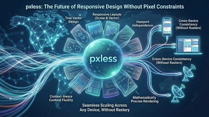
In the ever-evolving landscape of web design, few topics spark as much debate as the use of pixels versus relative units. Enter pxless—a paradigm shift that challenges the very foundation of how we think about layout, typography, and user experience. pxless isn’t just another CSS methodology; it’s a philosophy that prioritizes accessibility, scalability, and future-proof design over rigid, screen-dependent measurements. In this comprehensive article, we will explore what pxless means, why it matters, how to implement it, and why abandoning pixel-based thinking could be the smartest move you make as a designer or developer in 2024 and beyond.
Understanding the Problem with Pixels
Before diving into pxless, it’s essential to understand why pixels have become problematic. For decades, pixels (px) were the go-to unit for web design. They offered precision, consistency, and simplicity. A button that is 100px wide on a desktop monitor would be exactly 100px wide on a laptop—or so we thought.
The reality is that pixels ignore the user’s preferences. Modern browsers allow users to set default font sizes, zoom levels, and display scaling. When you design with fixed pixels, you override these settings. A user with low vision who increases their default font size to 24px will see no change on your pixel-defined body text. That’s not just bad design—it’s exclusionary.
Furthermore, the explosion of device types—from foldable phones to 8K monitors—means that a pixel is no longer a pixel. The physical size of a pixel varies wildly across screens. A pixel on a 4K 27-inch monitor is physically smaller than a pixel on a 720p 7-inch tablet. By locking designs into pixels, you lose control over real-world sizing and readability. pxless solves this by shifting focus to relative, user-driven measurements.
What Exactly Is pxless?
pxless is a design and development approach that eliminates the use of absolute pixel units in favor of relative units like rem, em, vw (viewport width), vh (viewport height), percentages, and newer CSS capabilities like clamp() and container queries. The term “pxless” encapsulates both a technical practice and a mindset: designing for flexibility rather than fixed precision.
At its core, pxless acknowledges that the user—not the designer—should control the base scale of a website. By using relative units tied to the user’s default font size or viewport dimensions, pxless ensures that your design adapts gracefully to any screen, any zoom level, and any accessibility setting.
Key units in a pxless approach include:
-
rem: Relative to the root element’s font size (usually 16px by default, but changeable by the user).
-
em: Relative to the parent element’s font size.
-
vw/vh: Relative to the viewport’s width and height.
-
%: Relative to the containing block.
-
ch/ex: Relative to character width or x-height of the current font.
A pxless stylesheet contains no px declarations. Not for margins, not for padding, not for borders, not for font sizes—nothing.
Why Go pxless? The Benefits
Adopting a pxless workflow offers tangible advantages that go beyond philosophical purity.
1. Accessibility by Default
The most compelling reason to embrace pxless is accessibility. When you use rem for typography, spacing, and even component sizing, you respect the user’s browser settings. A user who sets their default font size to 20px will see your text at 20px (if you set font-size: 1rem). If they need to increase zoom to 200%, your layout will scale proportionally rather than breaking or overflowing. pxless turns accessibility from an afterthought into a baseline feature.
2. True Responsiveness
Media queries based on pixels are increasingly fragile. A design that looks perfect at 1200px might fail at 1199px. pxless combined with container queries and viewport-relative units creates fluid, intrinsic designs that adapt continuously rather than at fixed breakpoints. Instead of saying “when the screen is smaller than 768px, do X,” pxless encourages proportional thinking: “make this column 50% wide until it can’t comfortably fit its content, then wrap.”
3. Maintenance and Scalability
Have you ever tried to change the global spacing of a pixel-based design? You end up hunting through hundreds of margin: 8px and padding: 16px declarations. With pxless, you define a scaling system using rem. For example:
:root {
  --space-xs: 0.25rem;
  --space-sm: 0.5rem;
  --space-md: 1rem;
  --space-lg: 2rem;
  --space-xl: 4rem;
}
Now every margin and padding refers to these variables. To scale the entire design’s spacing, you change the root font size or adjust the variables in one place. pxless promotes DRY (Don’t Repeat Yourself) principles naturally.
4. Future-Proofing
We don’t know what devices will exist in five years. Foldable screens, holographic displays, or even browser environments on smart glasses—all will interpret pixels differently. A pxless design based on relative units and user preferences will survive these shifts. Pixel-based designs will require complete overhauls.
How to Implement pxless: A Practical Guide
Transitioning to pxless doesn’t mean rewriting everything overnight. Start with new components or gradually refactor existing projects. Here’s a step-by-step approach.
Step 1: Set Your Root Font Size (But Don’t Fix It in Pixels)
The classic pxless approach sets the root font size to 100%, which defaults to the user’s preferred size (usually 16px). Avoid this common mistake:
/* Don't do this */
html {
  font-size: 10px; /* Breaks user preferences */
}
Instead, do:
html {
  font-size: 100%; /* 1rem = user's default */
}
If you absolutely need a base scale for design convenience, use percentages:
html {
  font-size: 62.5%; /* 1rem = 10px IF user default is 16px, but respects user zoom */
}
This makes mental math easier (1.6rem = 16px equivalent) while still respecting user settings.
Step 2: Define All Spacing and Typography in rem
Every font size, margin, padding, border radius, and even box shadow should be in rem or em. Example:
body {
  font-size: 1rem; /* 16px default */
  line-height: 1.5;
  max-width: 60rem; /* 960px equivalent but scales with font size */
  margin: 2rem auto;
  padding: 1rem;
}

h1 {
  font-size: 2.5rem; /* 40px equivalent */
  margin-bottom: 0.5em; /* em relative to h1's font-size */
}

button {
  padding: 0.75rem 1.5rem;
  border-radius: 0.5rem;
}
Step 3: Use Viewport Units for Layout Scaffolding
For full-width sections or hero areas, vw and vh are your friends. But be careful: text sized purely with vw can become unreadable on very large or small screens. Combine with clamp():
.hero-title {
  font-size: clamp(1.5rem, 5vw, 4rem);
}
This pxless-friendly approach sets a minimum size (1.5rem), a preferred middle ground (5% of viewport width), and a maximum size (4rem). No pixels needed.
Step 4: Embrace Container Queries
Container queries are a newer CSS feature that allows components to respond to their parent container’s size rather than the viewport. They fit perfectly with pxless because they use relative units natively.
.card-container {
  container-type: inline-size;
}

@container (min-width: 30rem) {
  .card {
    display: flex;
    flex-direction: row;
  }
}
Here, 30rem is relative to the root font size, ensuring consistency across zoom levels.
Step 5: Audit and Remove Pixels
Use your browser’s developer tools to search for px in your CSS. Replace each occurrence with an appropriate relative unit. For border widths, use rem or em—even a tiny 0.0625rem (approximately 1px) scales better than a hard pixel.
Common Pitfalls and How to Avoid Them
Transitioning to pxless isn’t always smooth. Here are typical issues and solutions.
Pitfall 1: Pixel-Perfect Designs
Clients or designers often demand exact pixel precision. pxless doesn’t mean chaos—it means relative precision. Show stakeholders how scaling preserves proportions. Use design tools like Figma with plugins that convert pixels to rem based on a base size (e.g., 16px = 1rem).
Pitfall 2: Third-Party Components
Many UI libraries (like older versions of Bootstrap or Material UI) are hardcoded in pixels. You have two options: override their CSS with more specific pxless rules, or choose pxless-native libraries like Tailwind (with a rem config) or Open Props.
Pitfall 3: Subpixel Rendering
Sometimes, using rem for widths can cause fractional pixel values (e.g., 10.5rem = 168px on a 16px base). Browsers handle subpixel rendering differently, potentially causing slight layout shifts. The solution is to avoid extreme fractions and test across browsers. Modern browsers handle subpixels far better than a decade ago.
pxless in Practice: Real-World Examples
Major companies have quietly embraced pxless principles. GitHub’s design system uses rem for most spacing and typography. The GOV.UK Design System mandates relative units for accessibility compliance. Even WordPress’s default Twenty Twenty-Four theme uses rem extensively.
Consider a simple product card. A pixel version might be width: 300px; padding: 16px;—it fails if the user increases font size. A pxless version:
.product-card {
  width: min(100%, 20rem); /* max 320px equivalent */
  padding: 1rem;
}
This card will never overflow its container and will expand gracefully.
The Future of pxless
CSS is evolving to make pxless even more powerful. The relative-color syntax, light-dark() functions, and ongoing work on parent selectors all assume a relative-unit mindset. Browser devtools now default to showing computed values in rem and px, but encourage rem for authoring.
We may soon see a day where pixels become a legacy unit, much like points or picas. The web is inherently fluid; pixels try to impose a grid on a medium that resists it. pxless embraces the web’s nature.
Conclusion: Making the Leap to pxless
Adopting pxless is not just a technical change—it’s a philosophical one. It requires trusting your users, embracing flexibility, and letting go of the illusion of absolute control. The benefits—accessibility, responsiveness, maintainability, and future-proofing—far outweigh the initial learning curve.
Start small. Convert a single component to pxless. Then a page. Then an entire project. You will notice fewer layout bugs, happier users, and a design that looks intentional at any scale. The pixel has served us well, but its time is passing. The future is pxless.
Call to Action: Audit your current CSS for pixel usage. Replace one hardcoded pixel value with a relative unit today. Your users—and your future self—will thank you.